Draws the design against a population so you can see what it selects. Two views, and each answers a question that a table answers slowly:
Arguments
- x
A design object.
- y
The population data frame to draw against.
- type
"selection","probability"or"map".- seed
Optional seed for the
"selection"draw, so the picture is reproducible.- ncol
Dots per row in the
"selection"grid. Defaults to whatever fills the panel at its current aspect ratio.- max_dots
Frames larger than this are shown as an evenly spaced subset, noted under the title. Keeps individual dots visible.
- main
Title. Defaults to a description of the design.
- palette
Named list overriding any of
surface,ink,secondary,muted,recessive,accent,fill,rule.- coords
For
type = "map", the two columns to place rows by,c(x, y). Defaults to the design's ownacross(design_spread()) orcoords(design_spatial()); required for any other design.- ...
Passed to the underlying plot call.
Details
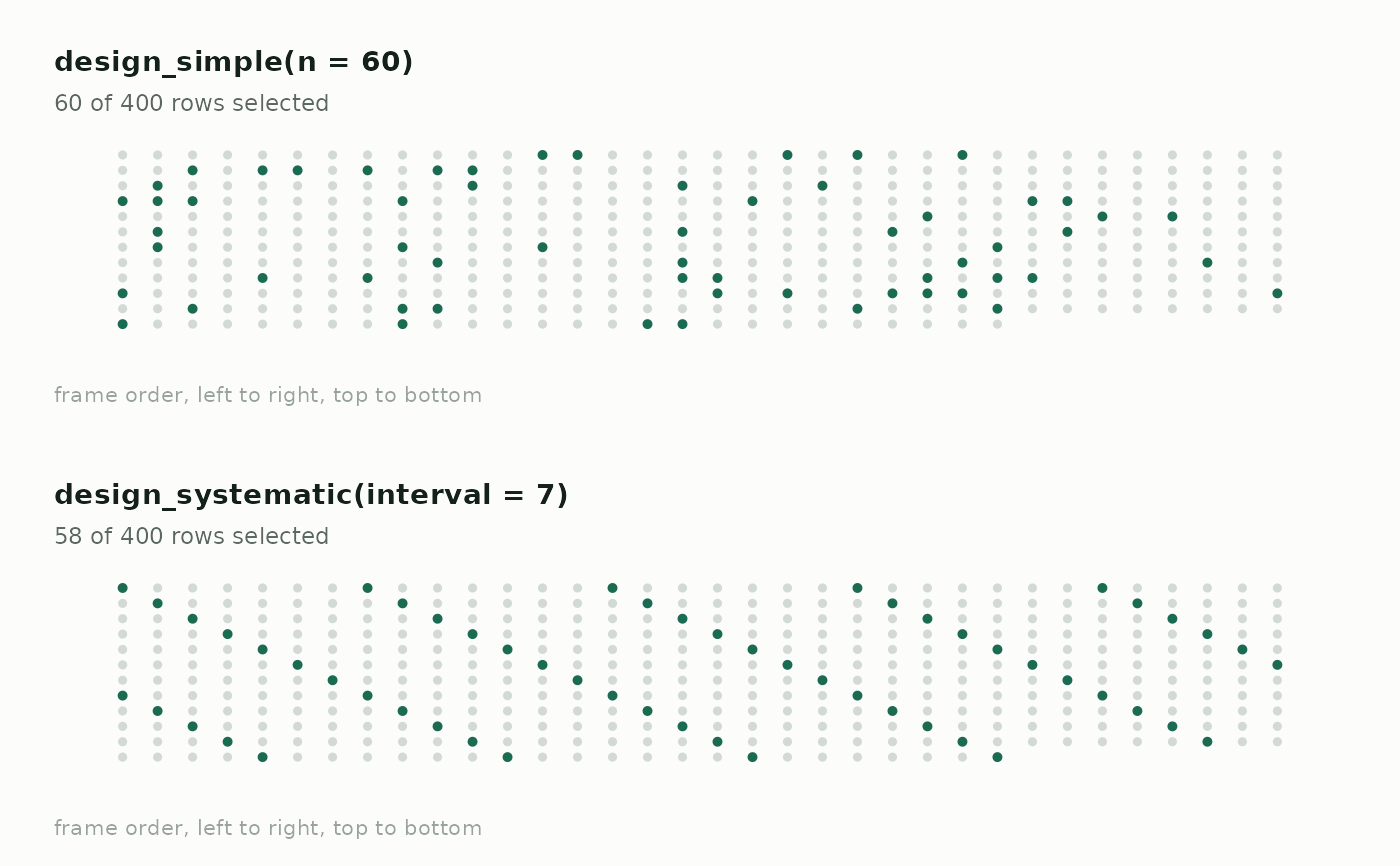
"selection"Every row of the frame as a dot, in frame order, with the selected ones filled in. Designs look distinct: simple random sampling scatters, systematic makes a lattice, cluster sampling takes solid contiguous runs, and probability-proportional-to-size thickens wherever the weight is large. If your frame is sorted by something meaningful, an unintended pattern shows up immediately.
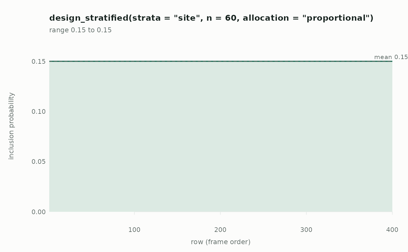
"probability"Each row's inclusion probability across the frame, as a step. Flat means every row had the same chance; plateaus mean strata; a rise means size-proportional selection. Rows the design can never reach sit at zero and are marked, which is usually the thing worth finding out.
"map"Every row placed by two columns — coordinates, or any two numeric variables — with the selected ones filled in. This is the view for
design_spread()anddesign_spatial(), where what matters is how evenly the sample covers the space: compare a simple random sample's clumps and gaps against a spread one.
Base graphics, so there is no plotting dependency to install.
Examples
pop <- data.frame(
id = 1:400,
site = rep(c("a", "b", "c", "d"), times = c(200, 100, 60, 40)),
cl = rep(paste0("c", 1:40), each = 10)
)
op <- par(mfrow = c(2, 1))
# Scattered, versus a visible lattice
plot(design_simple(n = 60), pop, seed = 1)
plot(design_systematic(interval = 7), pop, seed = 1)
 par(op)
# Where the probabilities sit
plot(design_stratified("site", n = 60), pop, type = "probability")
par(op)
# Where the probabilities sit
plot(design_stratified("site", n = 60), pop, type = "probability")