Plots: every figure anovakit returns, and how to customise them
Source:vignettes/articles/visuals.Rmd
visuals.RmdEvery anovakit function builds its figures with
ggplot2 and returns them in $plots.
Nothing is drawn as a side effect: a plot appears only when you print
it, and until then it is an ordinary ggplot object that you can change
with +, save, or throw away. This article shows every plot
each function returns, grouped by what it shows, and then how to
customise them. For the statistics behind the diagnostic plots, see the
diagnostics article.
The plots each function returns
One fit per function, on data used throughout this article:
bw <- transform(MASS::birthwt,
                race = factor(race, labels = c("white", "black", "other")),
                smoke = factor(smoke, labels = c("no", "yes")))
tg <- transform(ToothGrowth, dose = factor(dose))

fits <- list(
  welch  = anova_welch(chickwts, "weight", "feed"),
  kw     = anova_kw(InsectSprays, "count", "spray", diagnostics = TRUE),
  ancova = anova_ancova(MASS::anorexia, "Postwt", "Treat", "Prewt"),
  rm     = anova_rm(CO2, "uptake", subject = "Plant", within = "conc",
                    between = c("Type", "Treatment"),
                    emm_specs = c("conc", "Type")),
  manova = anova_manova(iris, names(iris)[1:4], "Species"),
  bin    = anova_bin(bw, "low", c("race", "smoke")),
  count  = anova_count(warpbreaks, "breaks", c("tension", "wool"),
                       interaction = TRUE),
  glm    = anova_glm(tg, "len", c("dose", "supp"), interaction = TRUE)
)
#> Registered S3 method overwritten by 'lme4':
#>   method           from
#>   na.action.merMod car
lapply(fits, function(f) names(f$plots))
#> $welch
#> [1] "means" "box"   "qq"
#>
#> $kw
#> [1] "box" "qq"
#>
#> $ancova
#> [1] "residuals" "qq"        "covariate" "emmeans"
#>
#> $rm
#> [1] "residuals" "qq"        "index"     "emmeans"
#>
#> $manova
#>  [1] "residuals_Sepal.Length" "qq_Sepal.Length"        "residuals_Sepal.Width"
#>  [4] "qq_Sepal.Width"         "residuals_Petal.Length" "qq_Petal.Length"
#>  [7] "residuals_Petal.Width"  "qq_Petal.Width"         "emmeans"
#> [10] "canonical"
#>
#> $bin
#> [1] "proportions" "emmeans"
#>
#> $count
#> [1] "emmeans"  "observed"
#>
#> $glm
#> [1] "box"       "residuals" "qq"        "emmeans"
anova_kw() returns its Q-Q plot only with
diagnostics = TRUE. anova_manova() returns a
residual plot and a Q-Q plot for each response, named after it.
anova_ancova() names its covariate plot
covariate when there is one covariate and
covariate_<name> for each of several.
print(fit) lists the plots a fit holds, and
plot(fit, "name") returns one.
Group summaries
These plots describe the data as observed, before any model.
Group means: anova_welch()
plot(fits$welch, "means")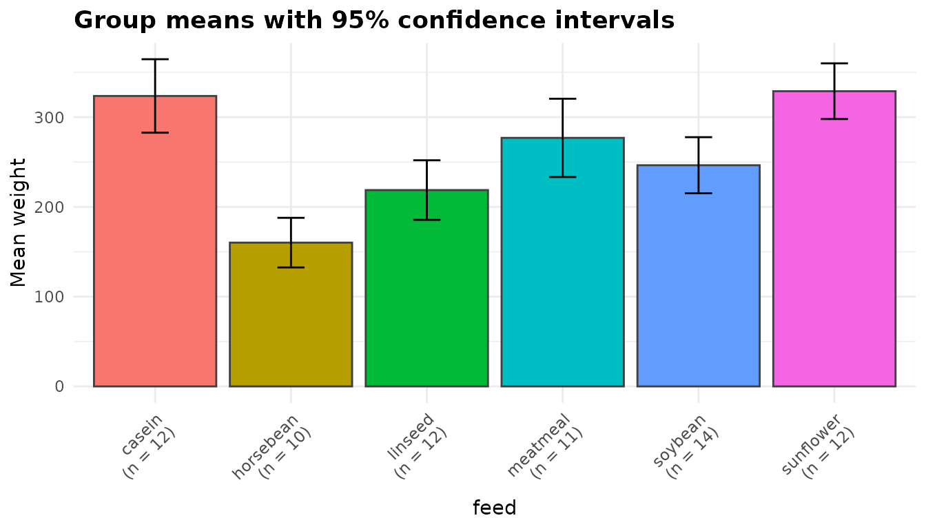
Each bar is a group mean and each error bar its t interval at
conf_level, computed from that group alone, so a small or
variable group gets a wide interval. The axis labels carry each group’s
size. These intervals describe the means one at a time; whether two
groups differ is a question for $posthoc, whose intervals
are for the differences.
Box plots: anova_welch(), anova_kw(),
anova_glm() and anova_count()
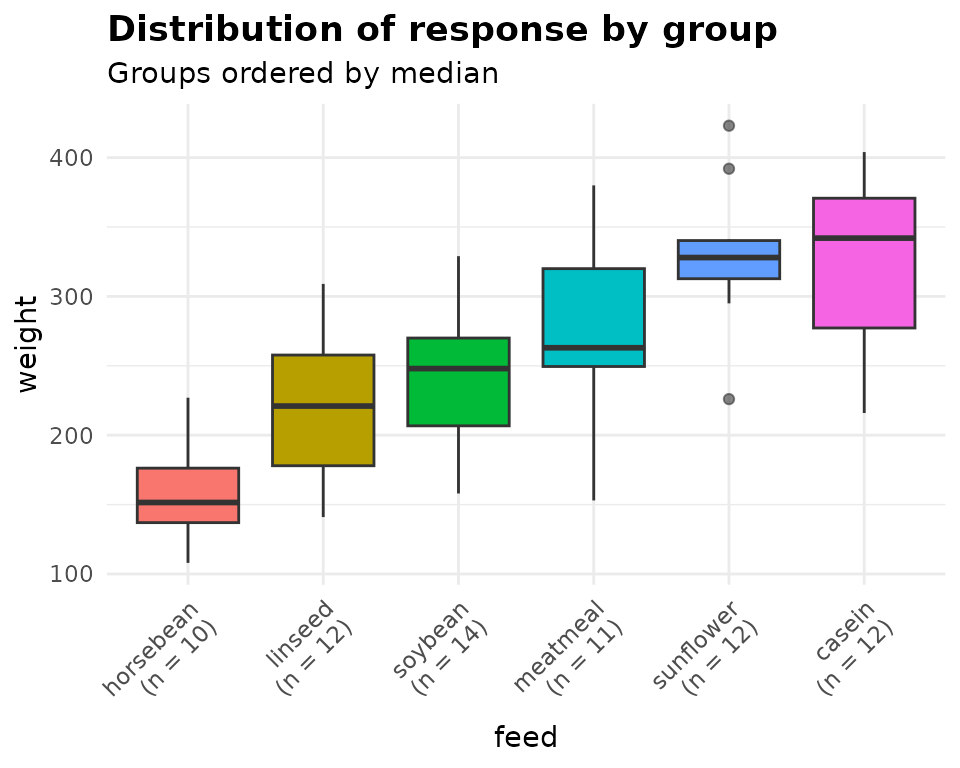
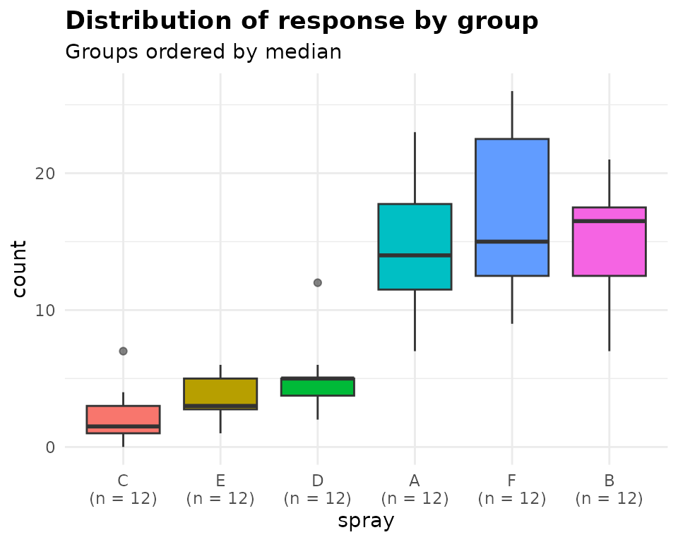
Four functions draw the response by group as box plots, with the
groups ordered by their medians and each label showing the number of
observations in that cell. anova_welch() and
anova_kw() call it box:
anova_glm() calls it box too (for a numeric
response), and anova_count() calls it
observed. With several grouping variables the boxes are the
cells of their combinations:
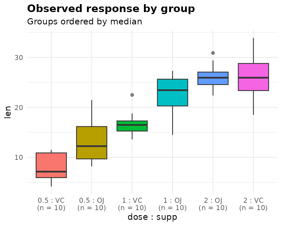
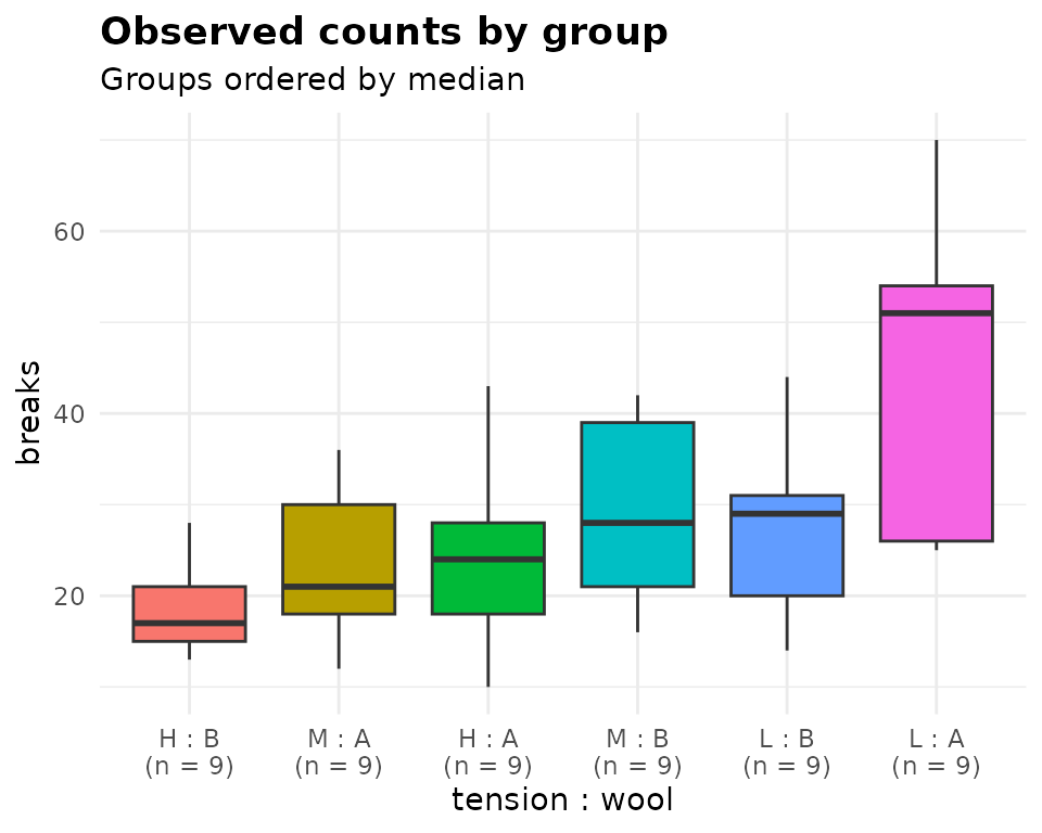
What to look for: boxes of very different heights (unequal spread,
which anova_welch() and robust standard errors allow for
and a pooled-variance model does not), a median off-centre in its box or
a long whisker on one side (skew), and points beyond the whiskers. In
the insect counts on the right of the first pair, the sprays with low
counts also have the smallest spread, as counts usually do: a hint that
a count model suits them better than a comparison of means.
When anova_count() has an exposure offset,
counts from units observed for different lengths of time are not
comparable, so its observed plot shows rates instead, count
divided by exposure. MASS::Insurance records claims against
the number of policy holders:
ins <- anova_count(MASS::Insurance, "Claims", "Age", offset = "Holders")
plot(ins, "observed")$labels[c("title", "y")]
#> $title
#> [1] "Observed rates by group (Claims per unit of Holders)"
#>
#> $y
#> [1] "Claims / Holders"
Observed proportions: anova_bin()
plot(fits$bin, "proportions")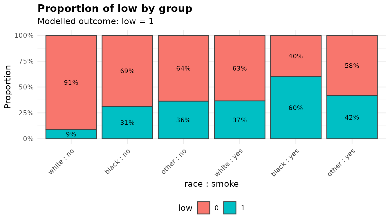
Each bar is one cell of the grouping variables, split into the proportions of the two outcomes and labelled with the percentages; the subtitle names the level being modelled. The cells are the combinations of every grouping variable, even when the model is additive, so this is the place to see an interaction the model does not include.
Marginal means with intervals
Every model-based function plots its estimated marginal means
($emmeans) with error bars at conf_level; the
subtitle says which level. The first grouping variable goes on the x
axis and any others are mapped to colour, with a line joining the means
of each of their levels. With a single (unordered) grouping variable
there is no line to draw: the groups have no order for it to follow, so
the means are points with error bars. As with the group means, the error
bars are intervals for each mean, not for the differences between them:
two bars can overlap while $posthoc finds a clear
difference.
anova_ancova() plots means adjusted to the covariate
mean, which is why the title says “covariate-adjusted”. Its single
grouping variable gives points and error bars only:
plot(fits$ancova, "emmeans")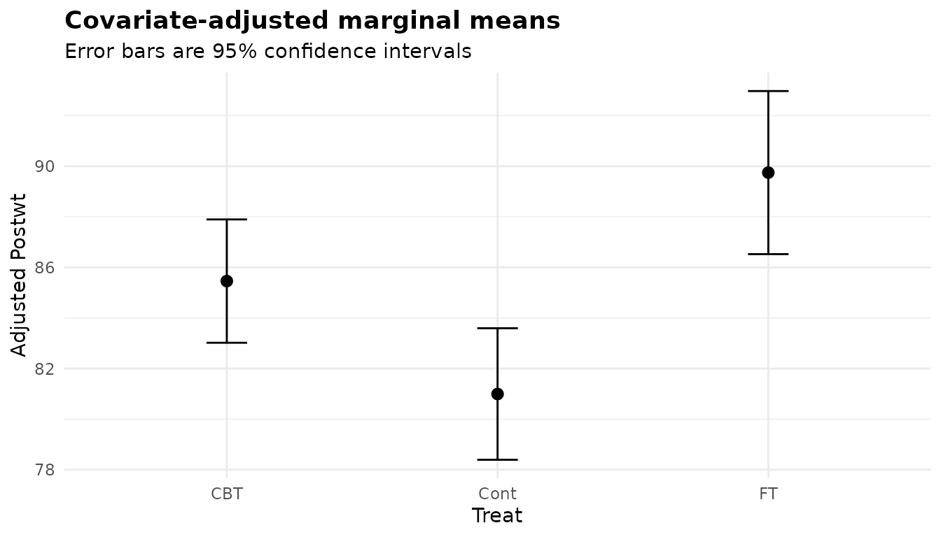
anova_glm() with an interaction plots one line per level
of the second factor, so lines that are not parallel are the
interaction. In the tooth growth data the advantage of orange juice over
vitamin C at the two lower doses has gone at the highest:
plot(fits$glm, "emmeans")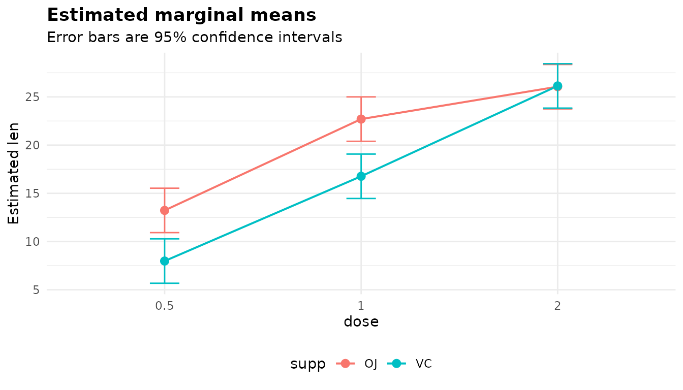
anova_count() plots the estimated mean count in each
cell, on the count scale (a rate per unit of exposure when there is an
offset). Here wool A breaks far more often than wool B at
low tension and no more often at the other two:
plot(fits$count, "emmeans")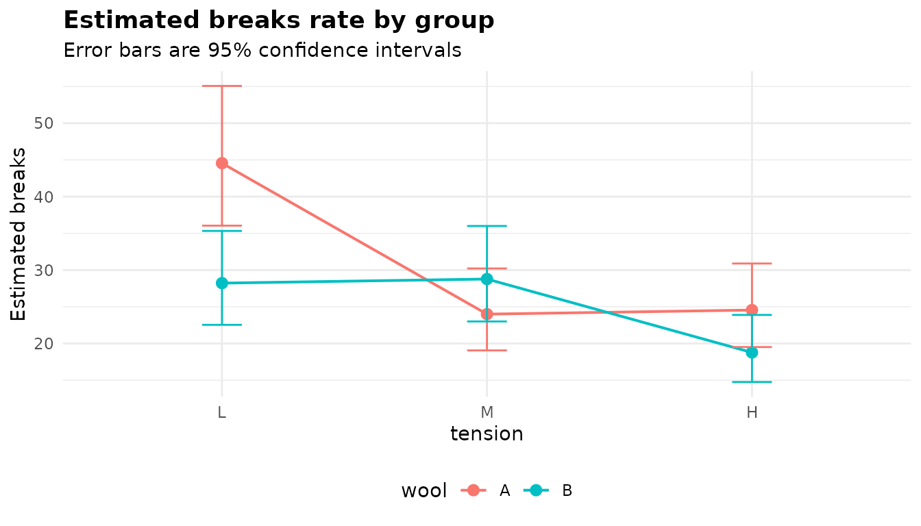
anova_rm() plots the factors named in
emm_specs (by default the within-subject factors). Here the
plant’s origin was added, so the lines compare the two types across
concentrations, and the gap between them widens as the concentration
rises:
plot(fits$rm, "emmeans")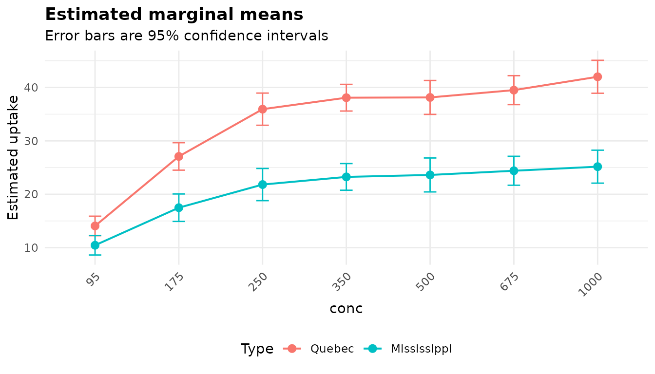
anova_manova() plots one panel per response, each with
its own y axis. As in the other functions’ plots, the means of a single
unordered grouping variable are points with error bars, not joined by a
line:
plot(fits$manova, "emmeans")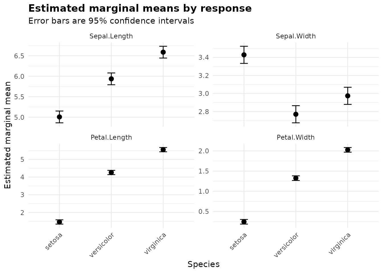
When the grouping variables enter a model additively (the default for
anova_bin(), anova_count(),
anova_glm() and anova_manova() with more than
one), the marginal means are reported for each factor separately,
averaged over the others, and the plot has one panel per factor:
plot(fits$bin, "emmeans")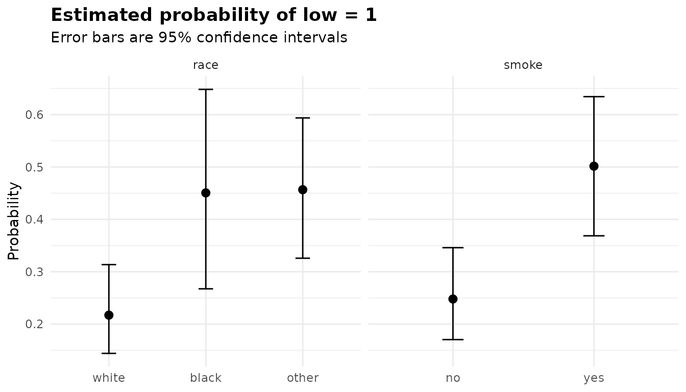
Residual diagnostics
Q-Q plots
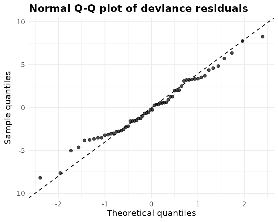
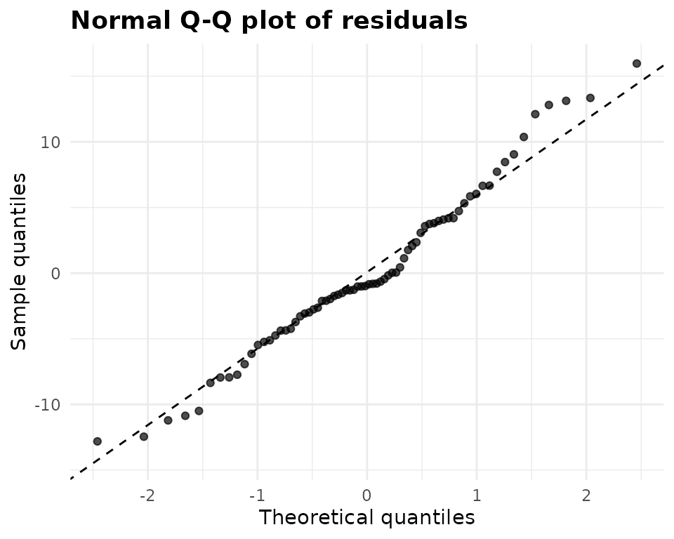
A Q-Q plot puts the sorted residuals against the quantiles a normal
distribution would give them. Points on the dashed line are consistent
with normality; an S shape (both tails beyond the line) means heavy
tails, a bow means skew, and horizontal steps mean tied or discrete
values. What goes into the plot differs by function.
anova_welch() standardises each value within its own group,
as Welch’s test allows each group its own variance;
anova_kw() does the same, as context only. The chick
weights follow the line closely:
plot(fits$welch, "qq")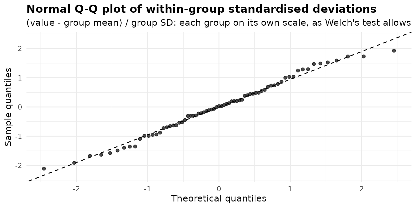
The insect counts rise above the line in the upper tail, the mark of right skew, and show short steps where counts are tied:
plot(fits$kw, "qq")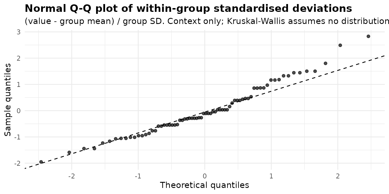
Residuals against fitted values
The model-based functions pair a Q-Q plot with a plot of residuals
against fitted values. In a model with only grouping variables the
fitted values take one value per cell, so the points line up in vertical
strips; compare the strips’ spread. anova_glm() plots
deviance residuals, which for a Gaussian model are the ordinary
residuals:
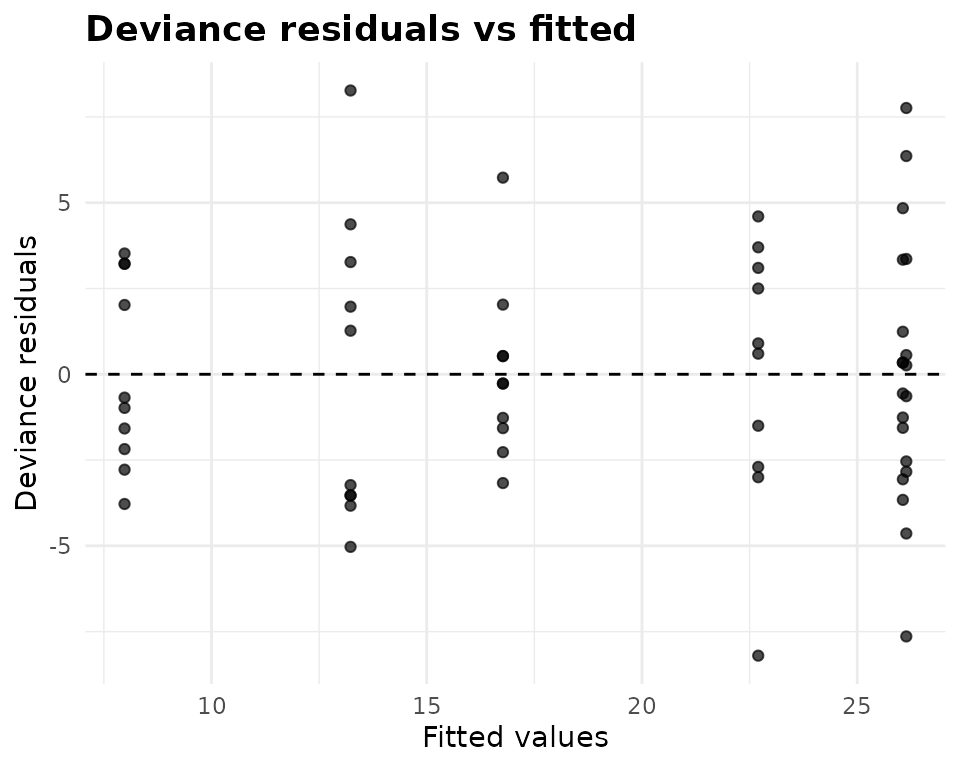
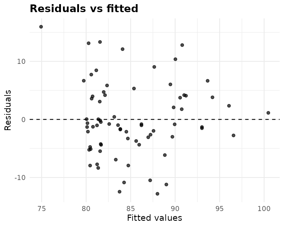
What to look for: a funnel, with the spread growing with the fitted
value, means the variance depends on the mean (use
vcov_type = "HC3", or a family or transformation that
expects it); a curve means the model misses something systematic. The
tooth-growth strips have similar spreads. With a covariate in the model
the fitted values spread out continuously, as in
anova_ancova():
anova_manova() gives both plots for each response, from
that response’s univariate model:
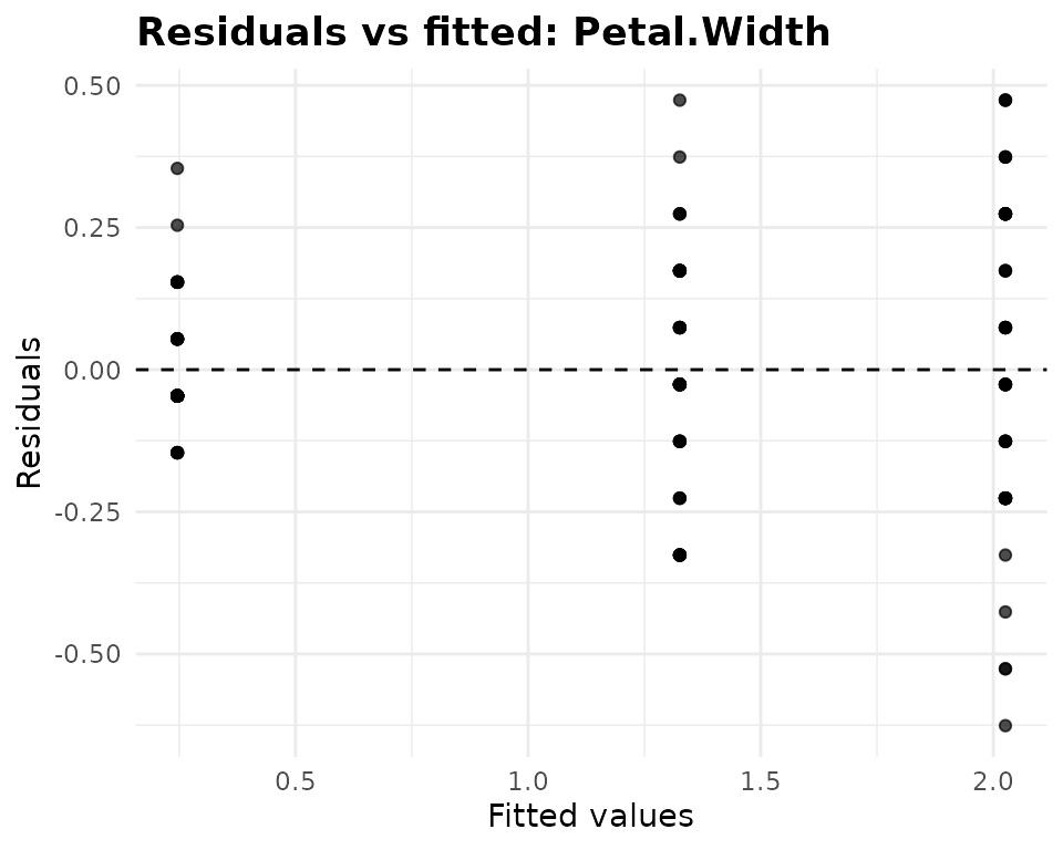
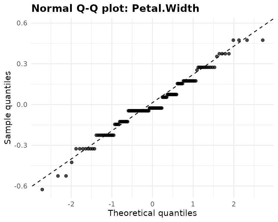
Petal width shows both patterns worth knowing. The strips widen from left to right, a funnel: the species with wider petals vary more (residual standard deviations of 0.11, 0.20, 0.27 for setosa, versicolor and virginica), which is part of what Box’s M detects. And the Q-Q plot moves in steps, because petal width is recorded to the nearest 0.1 cm, so many residuals are tied.
Repeated measures: residuals, Q-Q and index
anova_rm() plots the within-subject residuals, what is
left of each value after its subject’s mean and its cell’s mean are
removed, against the fitted values:
plot(fits$rm, "residuals")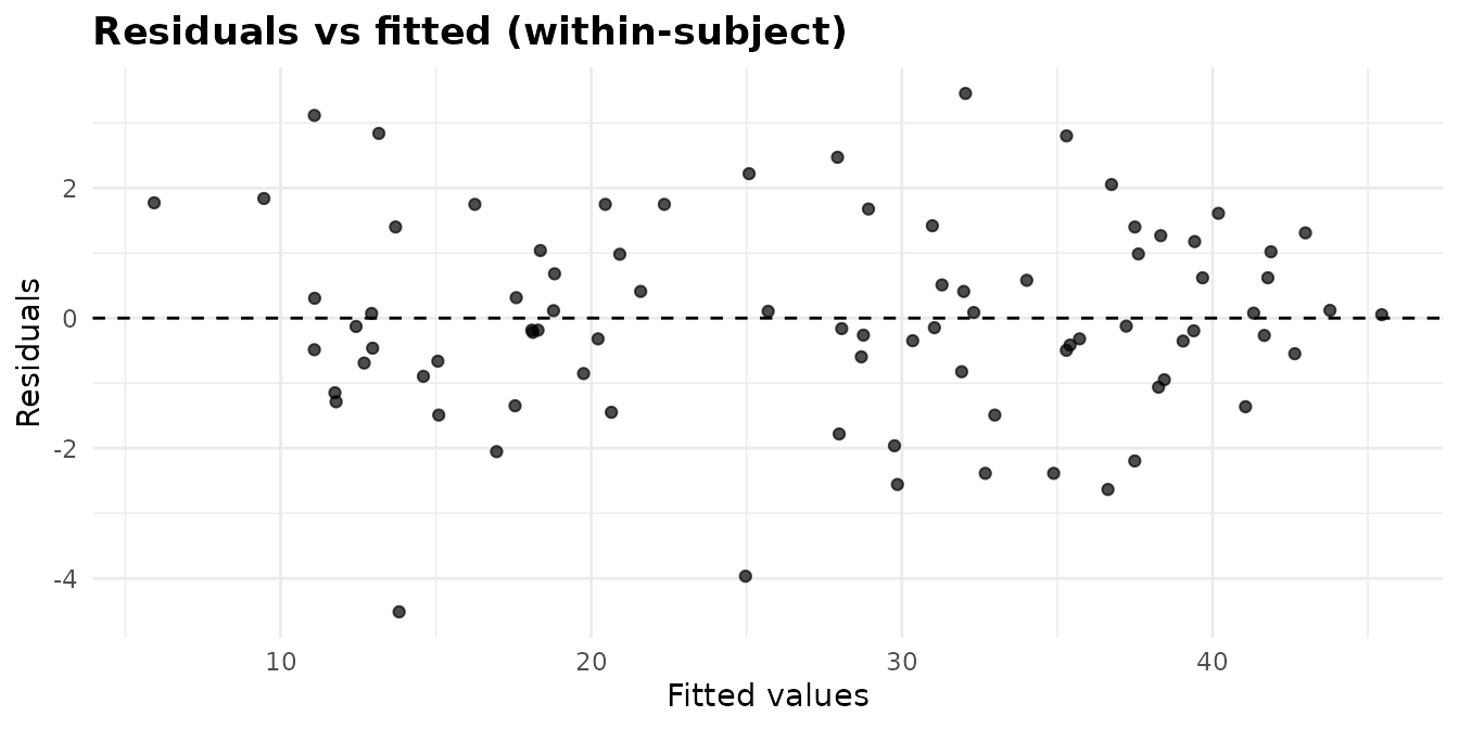
Its Q-Q plot standardises them within each within-subject cell, as
the normality tests in $assumptions$normality do:
plot(fits$rm, "qq")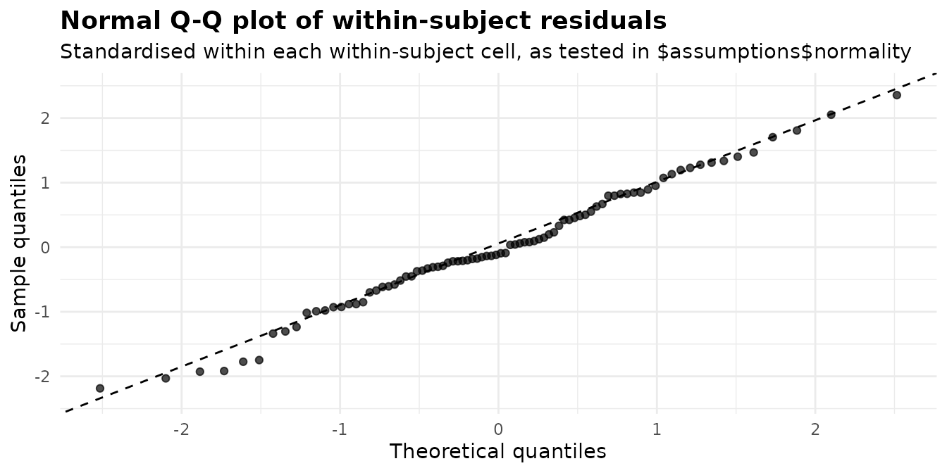
The third plot shows the same residuals in the row order of
$data_used:
plot(fits$rm, "index")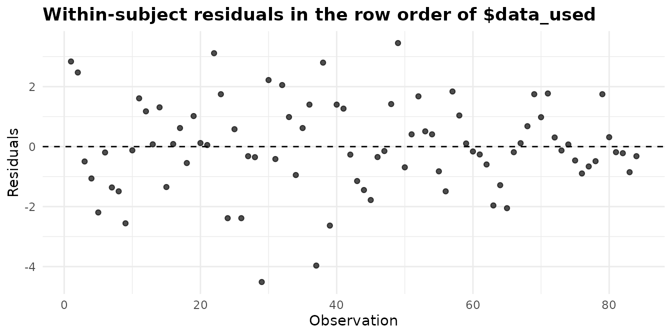
It is only as informative as that order. CO2 is sorted
by plant and, within plant, by concentration, so a run of residuals of
one sign would point to a plant whose response curve has a different
shape from the others’. In data stored in the order they were collected,
a trend here would point to drift over time.
Special plots
The covariate plot: anova_ancova()
plot(fits$ancova, "covariate")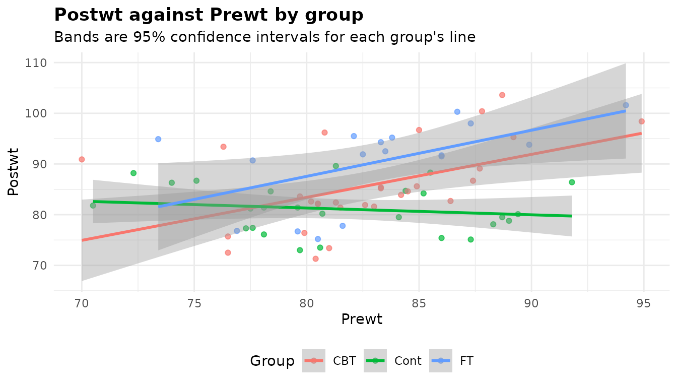
The response against the covariate, one colour and one fitted line
per group, with a confidence band at conf_level for each
line. It shows the two things an ANCOVA rests on. The slopes: an ANCOVA
with common slopes assumes parallel lines, and here the control group’s
line is flat while both treatment lines rise, which is why the
homogeneity-of-slopes test rejected and the fit kept the interaction
(see $slopes_test and $simple_slopes). And the
overlap: the adjusted means are read at the covariate mean, and a group
whose points do not reach that value is being extrapolated along its
line. The covariate is shown on its original scale even though the model
is fitted on the centred covariate.
The canonical plot: anova_manova()
plot(fits$manova, "canonical")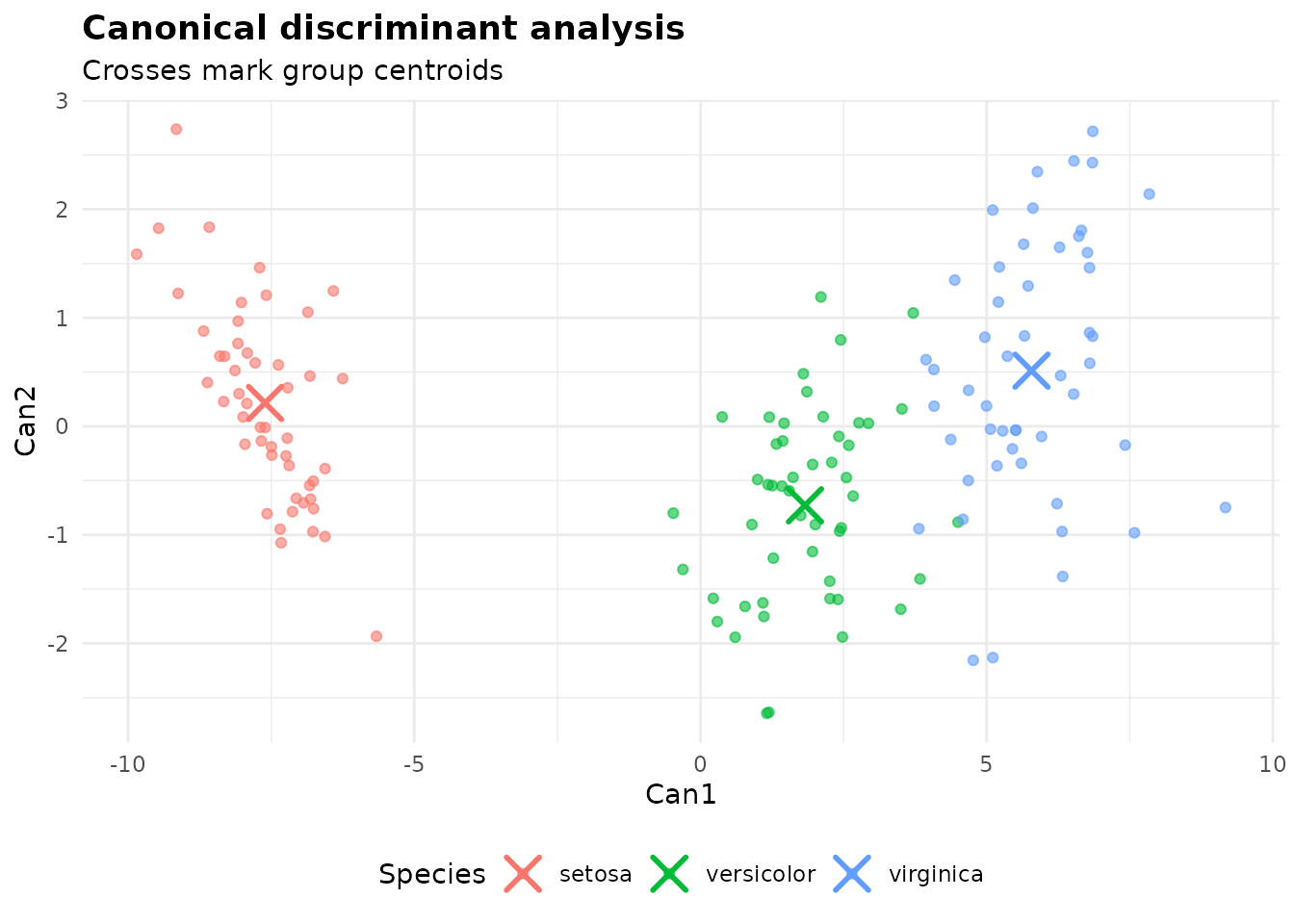
The canonical discriminant analysis finds the combinations of the
responses that separate the groups best. Each point is one observation’s
score on the first two axes, and the crosses are the group centroids.
The axes are scaled to unit pooled within-group variance, so a distance
of 1 is one within-group standard deviation: centroids several units
apart are well separated, as the three species are along
Can1. $canonical gives each axis’s share of
the between-group variation, and
$assumptions$structure_coefficients says which responses
each axis is made of:
fits$manova$canonical
#>   axis eigenvalue canonical_r prop_variance
#> 1 Can1  32.191929   0.9848209   0.991212605
#> 2 Can2   0.285391   0.4711970   0.008787395
fits$manova$assumptions$structure_coefficients
#>       response       Can1      Can2
#> 1 Sepal.Length  0.2225959 0.3108117
#> 2  Sepal.Width -0.1190115 0.8636809
#> 3 Petal.Length  0.7060654 0.1677014
#> 4  Petal.Width  0.6331779 0.7372421
Can1 carries 99.1% of the separation and is dominated by
the petal measurements. With only one estimable axis (two groups, or a
single-degree-of-freedom term) the plot is a box plot of
Can1 by group instead.
Customising
Getting a plot
plot(fit, "name") returns the stored object, the same as
fit$plots$name; plot(fit, 2) takes the second
by position, and plot(fit) the first. Asking for a name
that does not exist lists the ones that do:
Skipping them: plots = FALSE
Building the plots takes time, and each plot carries its own copy of the data it draws. When you only want the numbers, in a simulation or a loop over many responses, turn them off:
quick <- anova_manova(iris, names(iris)[1:4], "Species", plots = FALSE)
length(quick$plots)
#> [1] 0
identical(quick$multivariate, fits$manova$multivariate)
#> [1] TRUE
c(with_plots = length(serialize(fits$manova, NULL)),
  without = length(serialize(quick, NULL)))
#> with_plots    without
#>   24572810     144302
plot(quick)
#> This fit holds no plots (it was called with plots = FALSE).
The tables are unchanged, the time spent building the plots is saved,
and without its ten plots the MANOVA fit is 170 times smaller when
saved. plot() on such a fit says why it has nothing to
return.
Changing a plot with +
The rest of this article attaches ggplot2:
Anything you can add to a ggplot you can add to these: labels,
scales, themes, coordinates, facets, extra layers. The package’s plots
use theme_minimal() with a few adjustments: a bold title,
the legend at the bottom, and x labels rotated by 45 degrees when there
are more than six groups or any label is longer than eight characters.
Adding a complete theme such as theme_bw()
replaces all of that; adding theme() changes only the
elements you name.
A horizontal layout often suits long group names.
coord_flip() moves the group labels to the vertical axis
but leaves the rotation on the horizontal one, which is now the numeric
axis, so undo it there. Note too that labs() names
aesthetics, not positions: after the flip, x is still the
groups.
plot(fits$welch, "box") +
  coord_flip() +
  scale_y_continuous(breaks = seq(100, 450, by = 50)) +
  labs(title = "Chick weight by feed supplement", subtitle = NULL,
       x = NULL, y = "Weight at six weeks (g)") +
  theme(axis.text.x = element_text(angle = 0, hjust = 0.5),
        plot.title = element_text(size = 15))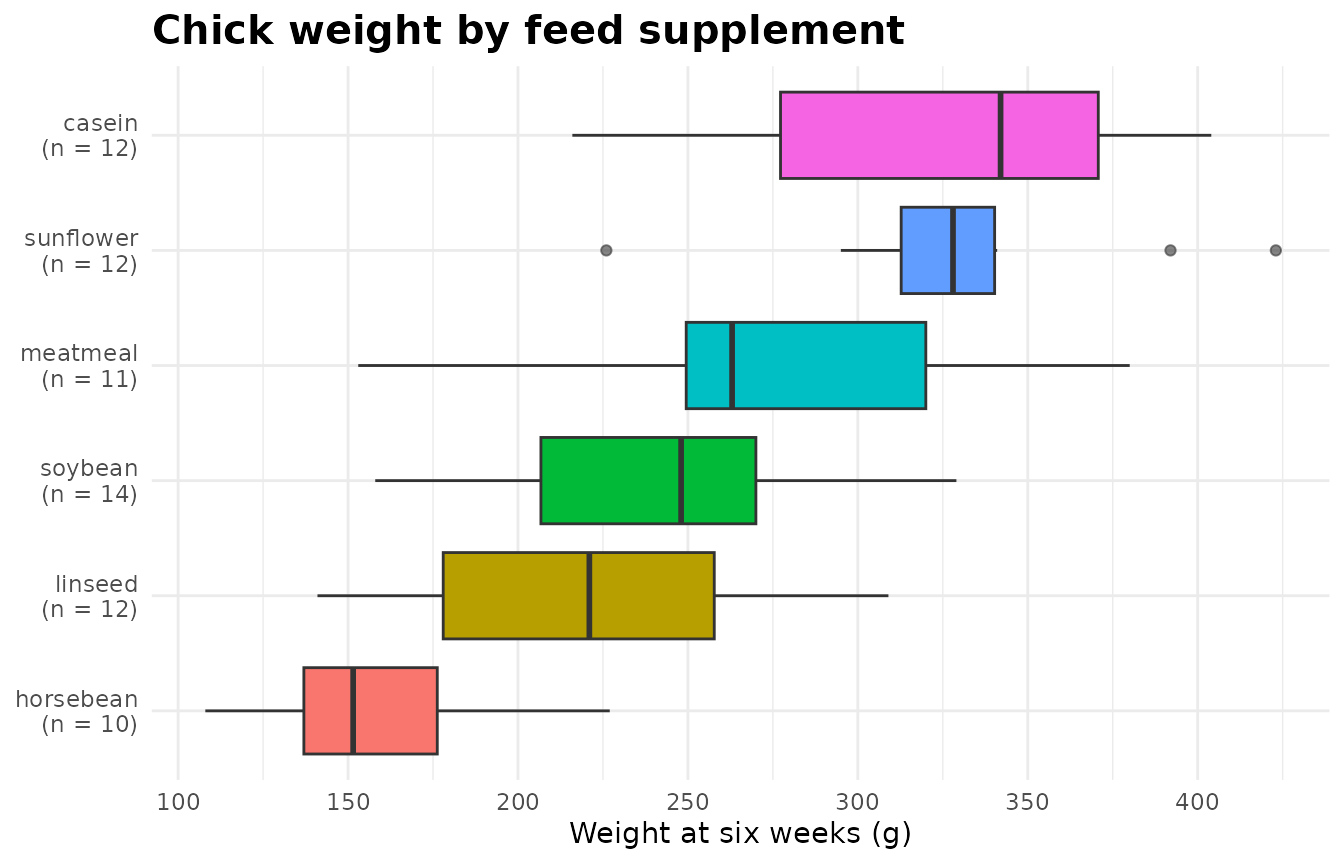
Colour-blind-safe palettes
The default ggplot2 palette separates groups by hue at equal
lightness, which readers with red-green colour blindness cannot always
tell apart. Two alternatives need nothing beyond R and ggplot2: the
Okabe-Ito palette, which ships with R as palette.colors(),
and the viridis scales built into ggplot2. Mapping a second channel,
such as point shape, helps too, and survives greyscale printing:
okabe_ito <- unname(palette.colors(palette = "Okabe-Ito"))[-1]  # drop black
plot(fits$glm, "emmeans") +
  aes(shape = .series) +
  scale_colour_manual(values = okabe_ito) +
  labs(colour = "Delivery", shape = "Delivery", x = "Dose (mg/day)",
       y = "Tooth length")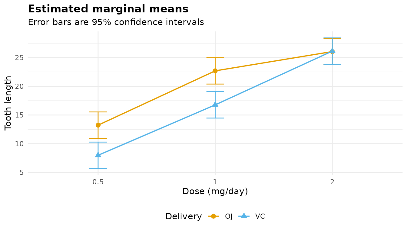
Giving the colour and the shape the same legend title merges their
legends. For the filled plots (bars, boxes and the proportions plot) the
equivalents are scale_fill_manual(values = okabe_ito) and
scale_fill_viridis_d().
To map something, you need the plot’s own column names. They are in
names(p$data); the line grouping of an emmeans plot with
several factors is .series, which is what the shape was
mapped to above.
Facets, and the per-factor plot of an additive model
A plot can be split by any column of its data. The covariate plot’s
group column is called .cell:
p <- plot(fits$ancova, "covariate")
names(p$data)
#> [1] "Postwt" "Prewt"  ".cell"
p + facet_wrap(~ .cell) + theme(legend.position = "none")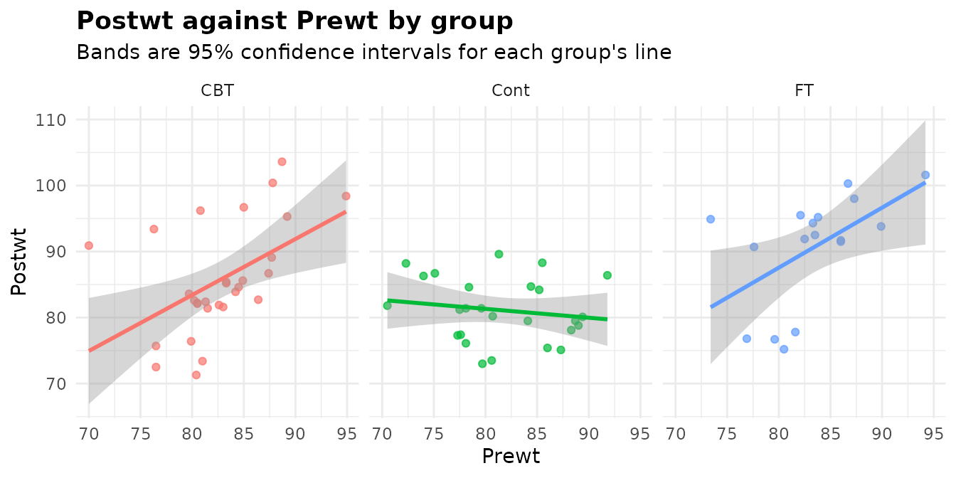
With one panel per group the three slopes, and the range of the covariate each group was observed over, are easier to compare.
The marginal means of an additive model are already faceted, one
panel per factor, by a column called .term. Adding a new
facet_wrap() replaces that faceting, which is how to change
its layout or its strip labels:
plot(fits$bin, "emmeans") +
  facet_wrap(~ .term, scales = "free_x",
             labeller = as_labeller(c(race = "Mother's race",
                                      smoke = "Smoked during pregnancy"))) +
  scale_y_continuous(labels = function(x) paste0(100 * x, "%")) +
  labs(y = "Probability of low birth weight")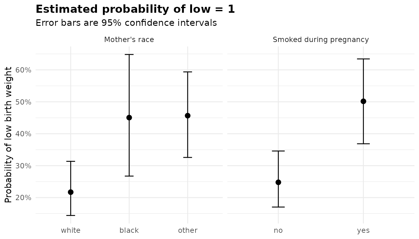
Building your own figures from $emmeans and
$posthoc
The tables behind the plots are ordinary data frames, so a figure the
package does not draw is a few lines away. A forest plot of every
pairwise difference makes the comparisons, rather than the means, the
thing you see. For the chick weights, from a Gaussian model, whose
$posthoc intervals are Tukey-adjusted:
cw <- anova_glm(chickwts, "weight", "feed", plots = FALSE)
ph <- cw$posthoc
ph$contrast <- factor(ph$contrast, levels = rev(ph$contrast))
ggplot(ph, aes(x = estimate, y = contrast)) +
  geom_vline(xintercept = 0, linetype = "dashed") +
  geom_pointrange(aes(xmin = conf_low, xmax = conf_high)) +
  labs(title = "Pairwise differences in chick weight",
       subtitle = sprintf("%s%% simultaneous intervals (adjust = \"%s\")",
                          100 * cw$conf_level, ph$adjustment[1]),
       x = "Difference in mean weight (g)", y = NULL) +
  theme_minimal()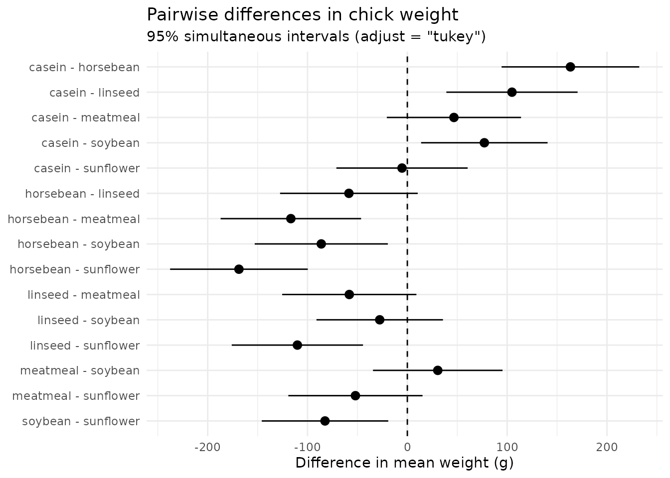
An interval that crosses the dashed line is a difference the data
cannot distinguish from zero at the adjusted level. The intervals in
$posthoc from the model-based functions are adjusted by
adjust; those from anova_welch() are
per-comparison intervals, so label them accordingly.
$emmeans works the same way: its estimate,
conf_low and conf_high columns are what the
marginal-means plots draw.
Ratios belong on a log scale, where an odds ratio of 2 and one of 0.5
are the same distance from 1. $effect_sizes of
anova_bin() holds each level’s odds ratio against the
reference level, with profile-likelihood intervals:
or <- fits$bin$effect_sizes
ggplot(or, aes(x = odds_ratio, y = comparison)) +
  geom_vline(xintercept = 1, linetype = "dashed") +
  geom_pointrange(aes(xmin = conf_low, xmax = conf_high)) +
  scale_x_log10(breaks = c(1, 2, 4, 8)) +
  facet_grid(factor ~ ., scales = "free_y", space = "free_y") +
  labs(title = "Odds of low birth weight",
       x = "Odds ratio (log scale)", y = NULL) +
  theme_minimal()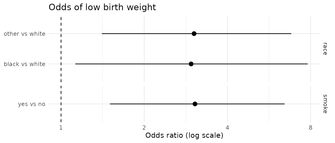
The same pattern works for incidence rate ratios (IRR in
the $effect_sizes of anova_count()) and for
the ratio column of a $posthoc on the log or
logit scale. If you summarise $emmeans_object yourself with
emmeans, pass level = fit$conf_level: the
grid carries emmeans’ own default level, not the fit’s.
Combining plots
Because each plot keeps its data, several plots of one kind can be combined into one faceted figure without any extra package. The four Q-Q plots of the MANOVA:
responses <- names(iris)[1:4]
qq_data <- do.call(rbind, lapply(responses, function(r) {
  data.frame(response = r,
             value = fits$manova$plots[[paste0("qq_", r)]]$data$value)
}))
ggplot(qq_data, aes(sample = value)) +
  stat_qq(alpha = 0.6) +
  stat_qq_line(linetype = "dashed") +
  facet_wrap(~ response, scales = "free_y") +
  labs(title = "Normal Q-Q plots of residuals, by response",
       x = "Theoretical quantiles", y = "Sample quantiles") +
  theme_minimal()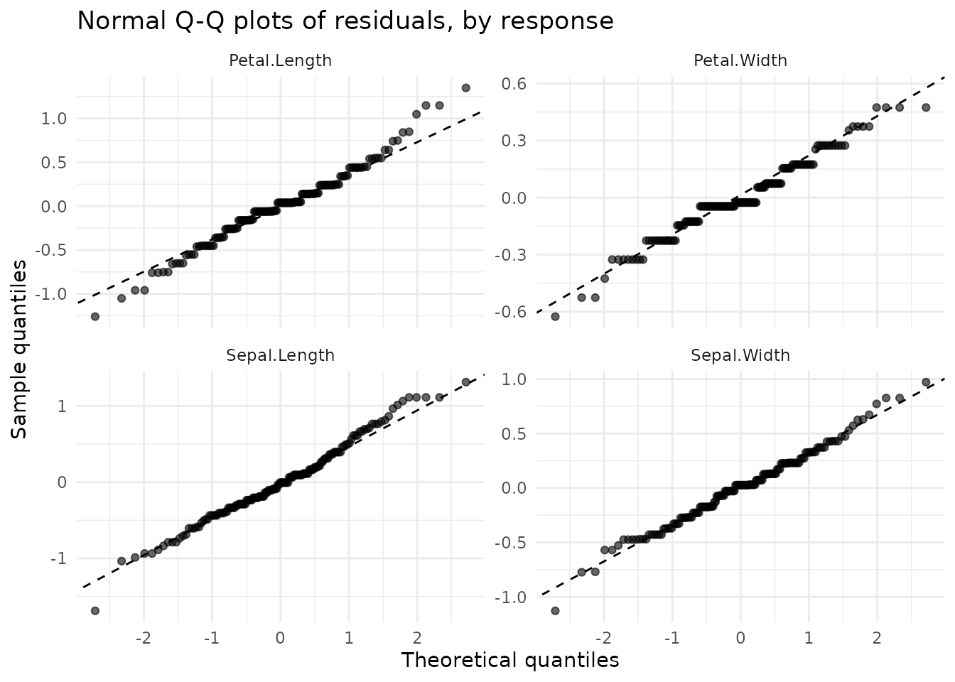
Placing different plots side by side is a job for a layout package. patchwork is the usual choice; it is not an anovakit dependency, so the chunk below is not run here:
In a report built with knitr, a chunk with
fig.show = "hold" and out.width = "50%" puts
consecutive plots side by side without any package, which is how the
pairs in this article were drawn.
Saving
ggsave() saves a ggplot to a file, with the format taken
from the extension. Give the size in inches and, for raster formats, the
resolution:
out <- file.path(tempdir(), "anorexia-covariate.png")
ggsave(out, plot(fits$ancova, "covariate"), width = 7, height = 4.5,
       dpi = 300)
file.exists(out)
#> [1] TRUE
A loop saves every plot of a fit, named after it:
dir <- file.path(tempdir(), "manova-plots")
dir.create(dir, showWarnings = FALSE)
for (nm in names(fits$manova$plots)) {
  ggsave(file.path(dir, paste0(nm, ".pdf")), fits$manova$plots[[nm]],
         width = 6, height = 4)
}
list.files(dir)
#>  [1] "canonical.pdf"              "emmeans.pdf"
#>  [3] "qq_Petal.Length.pdf"        "qq_Petal.Width.pdf"
#>  [5] "qq_Sepal.Length.pdf"        "qq_Sepal.Width.pdf"
#>  [7] "residuals_Petal.Length.pdf" "residuals_Petal.Width.pdf"
#>  [9] "residuals_Sepal.Length.pdf" "residuals_Sepal.Width.pdf"
PDF keeps lines and text sharp at any size, which suits print (so
does SVG, for which ggsave() needs the svglite package);
PNG at 300 dpi suits slides and documents.
conf_level sets every error bar
Every interval a function returns, and so every error bar and band in
its plots, uses conf_level. The titles and subtitles follow
it:
w99 <- anova_welch(chickwts, "weight", "feed", conf_level = 0.99)
plot(w99, "means")$labels$title
#> [1] "Group means with 99% confidence intervals"
a99 <- anova_ancova(MASS::anorexia, "Postwt", "Treat", "Prewt",
                    conf_level = 0.99)
plot(a99, "emmeans")$labels$subtitle
#> [1] "Error bars are 99% confidence intervals"
plot(a99, "covariate")$labels$subtitle
#> [1] "Bands are 99% confidence intervals for each group's line"
The bars and bands are then wider by exactly the change in the
critical value: for the casein group, the 99% interval for the mean is
1.41 times as wide as the 95% one. To show a different level, refit with
conf_level rather than editing the plot: the intervals in
the tables and the figures then agree.
See also
- Diagnostics for what the residual plots and the tests beside them check, and what to do when they fail.
-
Working with results for
$emmeans,$posthocand the rest of the returned object. - The per-function articles, each with its own plots in context: Welch, Kruskal-Wallis, ANCOVA, GLM, repeated measures, MANOVA, binary, counts.